
You came for one thing. You left with five. And somewhere between landing on the page and hitting “Place Order,” a button quietly did most of the heavy lifting. Here’s the science behind the most powerful four words in e-commerce — and why your brain never stood a chance.
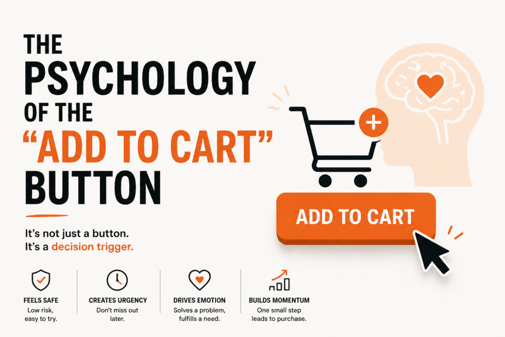
It’s Just a Button. Except It’s Not.
The “Add to Cart” button is the single most studied, tested, debated, and obsessed-over element in all of digital marketing. Companies have run thousands of A/B tests on it. They’ve argued about its color in boardrooms. They’ve hired psychologists to study how people’s eyes move toward it. They’ve changed one word on it and watched revenue jump by millions of dollars.
And from the outside, it still looks like just a button.
But that button is the culmination of an entire psychological journey — one that starts the moment you land on a product page and ends the moment you either click or close the tab. Understanding that journey doesn’t just make you a smarter shopper. It makes you a dramatically better marketer.
Because if you know why people click, you know how to make them click.
Stage 1: Before the Button — The Page That Sets the Trap
The psychology of “Add to Cart” doesn’t start with the button. It starts with everything that comes before it.
The Price Anchoring Game
Notice how almost every product page shows a “was” price crossed out next to a “now” price? That’s anchoring — one of the most well-documented cognitive biases in behavioral economics. The first number your brain sees becomes the reference point. Everything after is judged against it.
If you see a jacket listed at ₹8,000, your brain files that as “the price.” If you then see it crossed out with ₹5,000 next to it, you don’t feel like you’re spending ₹5,000. You feel like you’re saving ₹3,000. The psychological experience of saving money triggers genuine pleasure — the same reward pathways activated by other pleasurable experiences.
You weren’t planning to buy a jacket. But your brain just got offered a win, and it wants to take it.
The Scarcity Signal
“Only 3 left in stock.” “Selling fast.” “12 people are viewing this right now.”
These little lines of text are doing serious psychological work. They trigger loss aversion — the well-established human tendency to feel the pain of losing something far more acutely than the pleasure of gaining it.
You weren’t going to buy the product. But now it might not be there tomorrow. And suddenly not buying feels like a loss rather than a neutral decision. The brain hates losses. So it pushes you toward the button.
Robert Cialdini called this the principle of scarcity in his landmark book Influence, and marketers have been exploiting it — legitimately and otherwise — ever since.
Social Proof as Permission
“4.8 stars from 12,400 reviews.” “Amazon’s Choice.” “As seen in Vogue.”
These signals don’t just build trust. They give the brain permission to stop deliberating. When humans are uncertain about a decision, we look to what other people did and copy them. It’s an ancient survival shortcut — if everyone else chose this, it’s probably safe.
The review count, the star rating, the celebrity endorsement, the “bestseller” badge — all of these are telling your brain: other people already decided this was worth it. You can stop thinking so hard.
And the brain, which is fundamentally lazy and looking for any excuse to stop expending energy on a decision, gratefully complies.
Stage 2: The Button Itself — Four Words That Earn Their Keep
Now we get to the button. And every single design decision made about it — the words, the color, the size, the placement, the whitespace around it — has a measurable psychological effect.
The Words: Why “Add to Cart” Beats Everything Else
E-commerce brands have tested every variation:
- “Buy Now”
- “Purchase”
- “Order Now”
- “Get Yours”
- “Shop Now”
- “Add to Cart”
“Add to Cart” consistently outperforms the alternatives. Why? Because it’s psychologically low-commitment.
“Buy Now” triggers a fear response. It sounds final. It sounds like money leaving your account right now. The brain recoils slightly at the permanence of it.
“Add to Cart” sounds like browsing. Like window shopping. Like putting something on a wish list. It says: you’re not committing to anything yet. You’re just… considering. The psychological distance between “Add to Cart” and actually paying is wide enough for the brain to feel comfortable.
Of course, once something is in the cart, the sunk cost effect kicks in. You’ve already done the action. You’ve already made a micro-commitment. Completing the purchase starts to feel like the natural, logical continuation — not a fresh decision.
That’s the trap. “Add to Cart” is the foot in the door.
The Color: This Is Not a Branding Decision
The color of the “Add to Cart” button is one of the most A/B tested elements in the history of the internet. And the data points to a clear principle: contrast beats brand consistency.
The button needs to pop. It needs to be the most visually obvious thing on the page. Which color achieves that depends entirely on the page design — but orange, green, and yellow tend to outperform because they create contrast against the white or dark backgrounds most e-commerce sites use.
Amazon uses yellow. Shopify’s default themes lean toward dark, high-contrast buttons. The specific color matters less than this: the eye should land on the button without trying.
Eye-tracking studies show that shoppers spend a disproportionate amount of time looking at product images and the purchase button. Everything else on the page is noise. The button needs to sit in the path of least visual resistance.
The Size and Whitespace: Give It Room to Breathe
A button surrounded by clutter is a button that doesn’t convert. The whitespace around the “Add to Cart” button — the empty space that most designers instinctively want to fill — is doing active psychological work.
Whitespace signals importance. When something has space around it, the brain reads it as significant. Think of how auction houses display a single painting on a large white wall. The emptiness elevates the object. The same principle applies to buttons.
Make the button large enough to tap comfortably on mobile (44px minimum, according to Apple’s own UX guidelines). Give it air. Don’t crowd it with secondary CTAs that split attention and create decision paralysis.
Stage 3: After the Click — The Psychology of the Cart
The button gets clicked. What happens next is just as psychologically loaded.
The Micro-Reward
The best “Add to Cart” experiences give you an immediate, satisfying confirmation — an animation, a cart counter that ticks up, a gentle slide-out panel showing your item. This is a micro-reward. The brain gets a tiny hit of satisfaction that confirms it made a good decision.
It’s operant conditioning, essentially. The click felt good. Clicking again will feel good again. The path to checkout has been made neurologically pleasant.
The Cart as Commitment Device
Once items are in the cart, something subtle but powerful happens: the ownership effect kicks in. Behavioral economists call it the endowment effect — we value things more once we feel like they belong to us, even partially.
Your item is in your cart. It has a quantity. It has a subtotal. It feels, in some small way, like yours already. Removing it doesn’t feel neutral — it feels like giving something up. And as we established: the brain hates giving things up.
This is why cart abandonment emails work so well. “You left something behind” language is precisely calibrated to trigger loss aversion. You’re not being reminded of a purchase — you’re being reminded of a loss.
The Upsell: Why You Came for One Thing and Bought Three
“Frequently bought together.” “Customers also viewed.” “Complete the look.”
These recommendation modules are the psychological finishing move. They arrive at exactly the moment your brain has already made the most difficult decision — to spend money. The willpower required to decide to purchase has been spent. Adding one more item requires far less psychological energy than the original decision did.
This is sometimes called the “what the hell” effect in behavioral research. Once a mental threshold is crossed, the brain becomes more permissive about crossing it further. You’ve already decided to spend ₹3,000. What’s another ₹500?
Amazon reportedly generates a significant portion of its revenue through these cross-sell and upsell recommendations. The button brought you in. The algorithm keeps you spending.
What This Means If You’re Building or Optimizing a Store
Whether you’re running a Shopify store, an online course platform, or a service booking page, the same principles apply. Here’s how to use them ethically and effectively:
1. Audit your anchor pricing. Are you showing a clear before/after price where applicable? Is the discount immediately obvious? If your pricing looks flat with no reference point, you’re leaving perceived value on the table.
2. Use real scarcity — never fake it. Real low stock counts, real enrollment deadlines, real limited availability — these work. Fake urgency (“Only 2 left!” when you have 500 in the warehouse) destroys trust the moment customers figure it out. And they do figure it out.
3. Test your button copy. If you’re using “Buy Now” or “Purchase,” run an A/B test against “Add to Cart” or something softer. You might be surprised how much a single word change moves the needle.
4. Check your contrast. Open your product page on your phone and squint at it. Does your button immediately pop? If you have to look for it, your customers won’t find it either.
5. Make the post-click experience feel rewarding. A satisfying animation, a clear confirmation, a cart summary that’s easy to review — these micro-experiences build purchase momentum. Don’t let the click land in silence.
6. Write your cart abandonment emails around loss, not reminder. “You left this behind” outperforms “You forgot to checkout.” The psychological framing of loss versus neutral forgetfulness makes a measurable difference in recovery rates.
The Ethical Responsibility That Comes With This Knowledge
Here’s the part most marketing blogs skip.
Everything described in this post — scarcity signals, anchoring, loss aversion, the endowment effect — can be used honestly or manipulatively. The line between ethical persuasion and dark pattern design is real, and it matters.
Using genuine scarcity to communicate real stock levels is good marketing. Manufacturing fake urgency to pressure a hesitant customer is manipulation. Designing a clear, high-contrast button that’s easy to find is great UX. Hiding the “remove from cart” option to make abandonment harder is a dark pattern.
The best marketers understand that short-term conversion gains from manipulation are almost always destroyed by long-term trust loss. Customers who felt tricked don’t come back. They leave reviews. They tell people.
The psychology in this post is powerful. Use it to make genuinely good products easier to say yes to — not to make bad products harder to say no to.
That’s the difference between marketing and manipulation. And it’s worth knowing which side of the line you’re standing on.
Key Takeaways
- The “Add to Cart” journey starts long before the button — anchoring, scarcity, and social proof prime the brain to purchase.
- “Add to Cart” outperforms “Buy Now” because it feels low-commitment — the foot-in-the-door technique disguised as a button.
- Button color should maximize contrast, not match the brand palette. The eye needs to find it without trying.
- Whitespace around the button signals importance. Give it room.
- The endowment effect and loss aversion make cart abandonment emails one of the highest-ROI tools in e-commerce.
- Cross-sells work because the hardest purchase decision has already been made — adding more requires less willpower.
- With great psychological power comes real ethical responsibility. Use these tools to help customers say yes to things that genuinely serve them.